
As a chartist, there are lots of charts to choose from to make a point about how bullish or bearish the market is. However, when you pick broad market charts, there is very little to argue a point. Composite exchange ( all the stocks in a group) charts reach a broad swath of the economy, and help us see a wider view, rather than a narrower selection of the Nasdaq 100, the $SPX, the Dow 30 or a specific industry.
NYSE LINE CHART
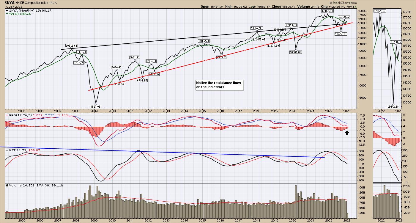
The charts below are from the NYSE. The $NYA is the ticker symbol for the ‘stock exchange’ rather than a select group of America’s best charts.
This week, the NYSE composite chart sits at an important crossroad that it has not been at for a long time. The junction of the top trend line since the 2007 high, the support trend line since 2010 and the 10 month moving average are all providing support under this chart after the frenzy of free government money for everybody in 2020. The chart exploded higher in 2020 through 2021 and slipped lower for most of 2022. This chart bottomed in October 2022.
The PPO on the chart above is trying to turn up, just above zero. That looks very bullish if we turn higher from here. We do not want to see the PPO start to fail and drop below zero.
Another interesting clue is that in the 2008-2009 crisis, volume accelerated above the average until the market lows of October 2008 were in. The current volume seems comfortable below the moving average, hinting that large investors are not too worried we don’t get through this.
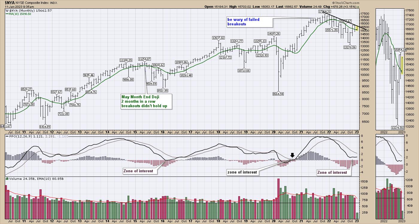
NYSE BAR CHART
When I look at the monthly bar chart rather than a line chart, a few other clues are in play. A bar chart shows the price throughout the month, not just the closing price.
Price sits at the monthly trend line. We have had four months of higher lows so far. We also seem to be holding above the 10 month moving average which was resistance in the middle of 2022. The PPO is the same as the chart above, and it tells us that this is a typical bounce point. The difference is, we are doing this bounce without the Fed’s help.
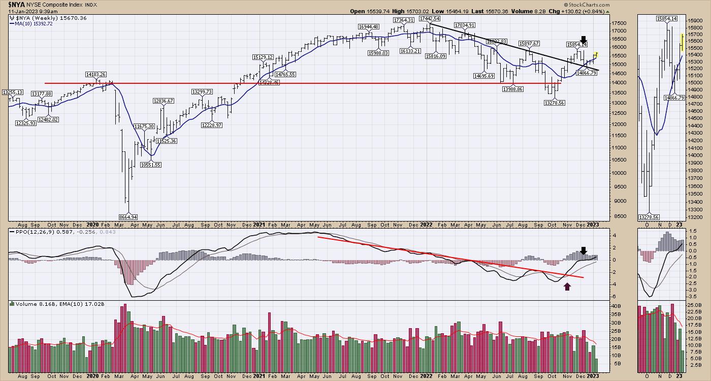
NYSE WEEKLY BAR CHART
When I move to the weekly chart below, a few more interesting things happen.
The chart is holding above the 10 WMA which is the blue line. This was support all the way through 2020 and most of 2021. It is also trending up and has clearly broken any downtrend drawn on the moving average. Price on a weekly chart looks much better and has broken a down trend line on the previous highs and has bounced off that line. The PPO is turning up very bullishly, right at zero.
As we continue to rally, this looks more and more like a bull market start. I have a variety of charts telling me to be more positive on the outlook. It seems each week in the newsletter to clients, the markets are improving their bullish outlook.
I also did a presentation about how we expect to manage the market turbulence in 2023 as we have a couple of interesting crossroads coming at us. That presentation can be found here. Investing Strategies From Osprey Strategic.

Grab a beverage and see if some of the ideas presented can help you preserve capital while enjoying the upside. Have a wonderful 2023!