
I seriously hope that I was able to make clear in last Tuesday’s Sector Spotlight that the market ($SPX) is still on shaky grounds and certainly not (back) in an uptrend. Sure, I mentioned the short-term improvement, which was undeniably there. But also that the upside was littered with resistance, and more confirmation would be needed for the longer-term trend to turn back up. That has not happened yet; as a matter of fact, the market stalled and turned at the first resistance level it met. And yes, that was sooner than I expected. 😉
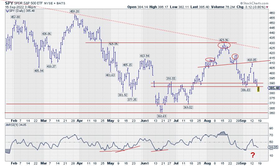
Gapping down on Tuesday with another opening gap down today (Friday) brings SPY back below its previous low (387) and back to square one. This move reinstates the downtrend that started after completing the small H&S top on 26 August. It also means that 386, 390 and the area inbetween are now expected to start serving as resistance. The daily chart of SPY shows this.
BUT… We have to keep an open mind.
The ease of movement is to the downside at the moment. After today’s break, below 387, the path is cleared for a further move towards the 370 or even 360 level. However, a few things do not resonate with a bear market in full force and are keeping me awake… Well, maybe not literally, but it certainly has my attention, as I tried to express in Sector Spotlight and on The Final Bar last Wednesday.
The first one is the non-confirmation of the recent dip by the RSI. If you look at the graph above, you can see that the RSI has not (yet) dipped below its previous low, as SPY has done in the price chart. This means that it is still possible for SPY to develop a positive divergence between RSI and price. For this to materialize, we will need to see SPY turning up again within the next few daily bars. When that happens, we may see another attempt to move higher. But it will not change the fact that the upside is littered with resistance.
The second thing is an unusual or unexpected sector rotation; more specifically, the rotation for the Consumer Discretionary sector.
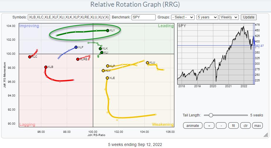
On the weekly Relative Rotation Graph, we see the XLY tail rapidly move into the leading quadrant at the highest JdK RS-Momentum reading in this universe. That shows strength! At the same time, the defensive sectors are still to the right, inside the weakening quadrant. XLU has the highest RS-Ratio reading and is turning back up towards leading, while XLP and XLV move opposite the XLY tail towards the lagging quadrant.
The worst sector, without a doubt, is Communication Services. The weekly tail has just completed a turn from improving back down into lagging, while remaining at the lowest RS-Ratio reading of the entire universe. It does not get much weaker than this.
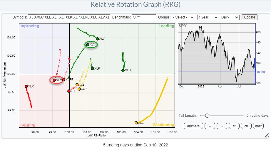
Zooming in on last week’s rotation on the daily RRG shows the tail for XLY rotating into the leading quadrant at a strong RRG-Heading, which underscores the strength that was noted on the weekly RRG. The XLC tail is rotating from improving back into lagging and is also confirming the rotation that is playing out on the weekly RRG. The defensive sectors on the daily RRG are all inside, leading but losing relative momentum.
My problem is that, in a full-fledged bear market, I do not expect the Consumer Discretionary sector to show up inside the leading quadrant in both the weekly and the daily time frame…
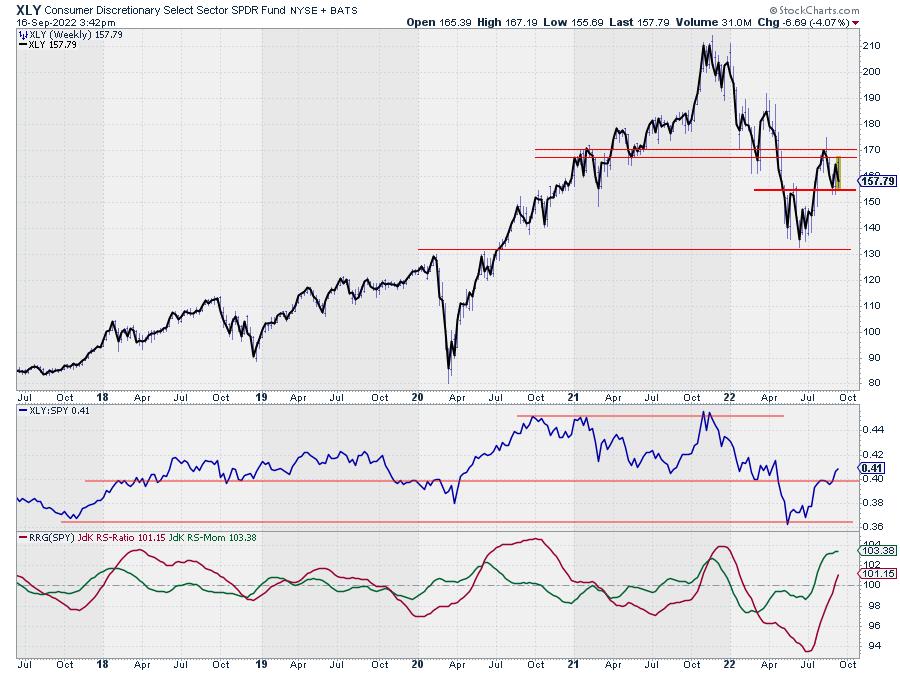
If we stick with the XLY chart for the moment, the improvement is clearly visible. Unlike SPY, XLY has not dropped below its recent low, but managed to stay above the May peak, which is now serving as support.
In the chart above, I have overlaid a thick line connecting the closing prices on top of the bar chart, from which you can see the weekly extremes. In this way, I am trying to eliminate some of the noise and get a clearer picture to determine the trend. Also, the break back above that horizontal level in relative strength has to be seen as a positive, at least for the sector. But at 12% of the S&P 500, Consumer Discretionary is the third largest sector, which can impact SPY’s direction. So, at minimum, I keep an open mind to the possibility that the market is trying to find support here while respecting the long-term downtrend still in play.
In situations like this, I always have to think about a saying we have in Dutch. It would translate into something like:
The nicest flowers are growing at the edge of the ravine.
Therefore, remain very careful, as we are close to the edge of a ravine. In terms of SPY, I think 360 will qualify as the edge. But when some nice opportunities arise between here and 360, they may qualify as low-risk opportunities, provided that tight stops are in place.
#StaySafe and have a great weekend, –Julius
Julius de Kempenaer
Senior Technical Analyst, StockCharts.com
Creator, Relative Rotation Graphs
Founder, RRG Research
Host of: Sector Spotlight
Please find my handles for social media channels under the Bio below.
Feedback, comments or questions are welcome at Juliusdk@stockcharts.com. I cannot promise to respond to each and every message, but I will certainly read them and, where reasonably possible, use the feedback and comments or answer questions.
To discuss RRG with me on S.C.A.N., tag me using the handle Julius_RRG.
RRG, Relative Rotation Graphs, JdK RS-Ratio, and JdK RS-Momentum are registered trademarks of RRG Research.