

[ad_1]
Friends, seasonal trades like “sell in May and go away” make for great headlines and even better trading opportunities.
So, what’s the next big seasonal opportunity that’s coming now that Thanksgiving has passed?
You guessed it…the “Santa Claus rally.”
Just to set the record straight, this seasonal trade is traditionally measured during the week leading up to and following Christmas.
But over my long career as a trader I have learned that the opportunities start surfacing well before this period.
Obviously, there is NO guarantee that the market is going to live up to its bullish tendencies during this HUGELY popular trading window.
That’s why I am doing what I always do when I look for bullish trade ideas, which is to find the sectors that are showing leadership.
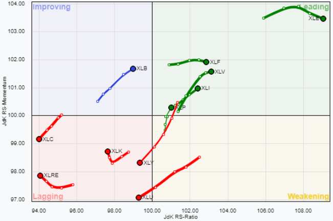
One of my favorite tools for getting a clear picture of sector rotation is called the Relative Rotation Graph (RRG).
Teachable Moment:
Relative Rotation Graphs are readily available on a number of charting platforms these days. Today, we’ll be using the version provided on the Stockcharts.com website.
Stockcharts.com describes RRG charts as follows: RRG® charts show you the relative strength and momentum for a group of stocks. Stocks with strong relative strength and momentum appear in the green Leading quadrant. As relative momentum fades, they typically move into the yellow Weakening quadrant. If relative strength then fades, they move into the red Lagging quadrant. Finally, when momentum starts to pick up again, they shift into the blue Improving quadrant.
The comparisons are made relative to some benchmark, which in most cases is the S&P 500.
Though it’s not visible on the top rotation graph below, the S&P 500 ETF (SPY) is positioned in the middle of the graph (where the X and Y axis meet), while the 11 S&P 500 sectors are positioned around the S&P 500 based on whether they are Leading, Weakening, Lagging or Improving relative to the S&P 500.
Key:
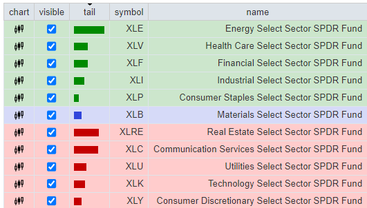
What the chart above is telling me right now is that the Energy, Healthcare, Financial, Industrial and Consumer Staples sectors have all been LEADING the S&P 500 over the past 4 weeks (green box), as the Materials sector has been IMPROVING vs. the S&P 500 (blue box).
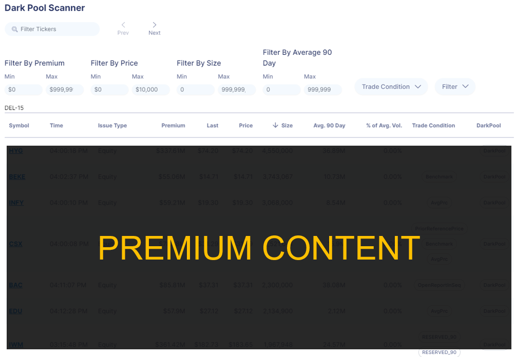
While this POWERFUL technical tool tells me which sectors are showing strength relative to the S&P 500, it’s my PREMIUM Dark Pool Scanner that tells where the largest and most sophisticated traders are trying to hide their trades.
Not only that, but it also helps me to see where the most crooked insiders are hiding, just like some elected officials may be doing.
I don’t know about you, but I have complete clarity on where I am looking for trades to get into RIGHT NOW ahead of the Christmas rush.
And I’ll be dropping those ideas here on MONDAY, with or without you.
Let’s all have a great weekend, and until next time!
[ad_2]
Image and article originally from ragingbull.com. Read the original article here.