
[ad_1]
DNY59
Pattern matching can be useful if the results are evaluated in the proper context. Usually, visual pattern matching is misleading; the human eye is not very good at calculating actual correlations.
Charts have recently emerged in blogs and financial social media that, according to their publishers, show a high degree of similarity between the price action in the S&P 500 Futures (SPX) this year from the all-time high of January 3 and the price action from October 19, 2009, both spanning 147 trading days. I have reproduced the chart below.
Comparison of Year-To-Date Price Action in S&P 500 to That in 2008 (Price Action Lab Blog – Norgate Data)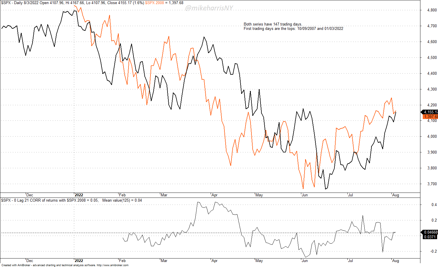
The black line represents the S&P 500 closing price through August 3, 2022. The orange line is the closing prices of the index starting from the top of October 9, 2007, and extending for the same number of days forward, 147 in total.
Visually, the two price series look very similar. However, the average 0-lag, 21-day correlation of daily returns is +0.04, i.e., the two series are not correlated.
Those who argue the chart reflects a high similarity in price action between 2007 and this year ignore the correlation, or even do not calculate it, and focus on visual trends. According to them, the two patterns are similar. It is hard to refute beliefs.
Below is the chart of the S&P 500 with more details about the price action from the 2007 top.
S&P 500 Chart in 2007 – 2008 Period (Price Action Lab Blog – Norgate Data)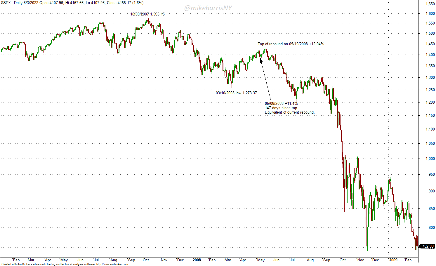
The top of the market was on October 10, 2007, on a closing price basis. The index made an intermediate bottom on March 10, 2008, and after 147 days, or on May 8, 2008, it had gained 11.4%. The current gain after the bottom of June 17, 2022, is 13.3%.
In 2008, the market rebound continued until May 19, for a gain of 14.04%, and afterward, a crash started that brought the index to new lows.
Based on the top of May 19, 2008, the pattern matching with the current chart indicates about 7 more days to a top and then the beginning of another correction to new lows. At least, this is the main argument from the pattern matching of 2007 and 2022 price action as presented in blogs and social media posts.
Pattern Matching Is Not Enough
The fundamentals of 2008 were different from the fundamentals of this year. In 2008, there was a financial crisis that peaked in September with the bankruptcy of Lehman Brothers. This year, there is no financial crisis, but there are inflation and supply problems. However, by July 2008, the CRB index was much higher than it is now, and inflation was at a respectable 5.5%. In addition, WTI crude oil spot was at around $144 versus just below $90 on August 4, 2022. The CRB, WTI, and CPI levels are shown in the chart below.
Chart of CRB, WTI, and CPI (Price Action Lab Blog – Norgate Data)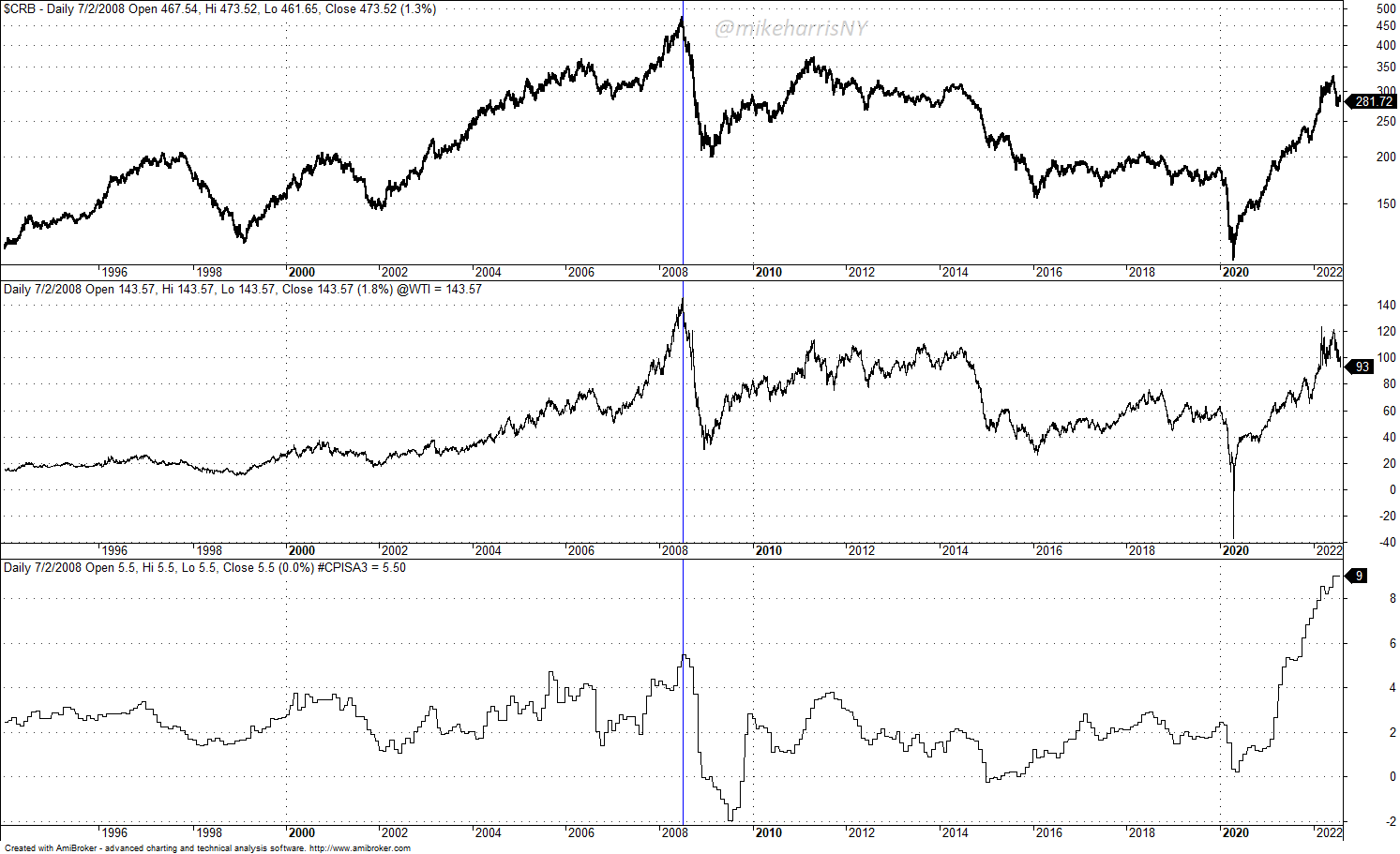
In other words, fundamental conditions in 2008 were way worse than what we currently have. If conditions worsen, then a reversal to new lows in stocks is possible. But with improving commodity prices, inflation, and falling bond yields, it is likely the pattern matching from 2008 will be partial.
Summary
Price action alone is insufficient for forecasting future price trends. Fundamentals are also important, and in 2008, economic conditions were much worse than they are currently. If economic conditions worsen, a reversal of the stock market to new lows may occur, but at this point, consolidation is the most probable path.
[ad_2]
Image and article originally from seekingalpha.com. Read the original article here.