
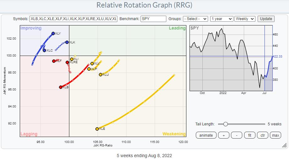
On the Relative Rotation Graph for US sectors, there are only two sectors that are leading the market higher. Not surprisingly, these are growth-related sectors, specifically XLK and XLY, which together make up 40% of the market capitalization of the S&P 500 index.
In last Tuesday’s episode of Sector Spotlight, I pointed out that the other offensive sectors are still in relative downtrends and that all defensive sectors are still in relative uptrends. They (defensive) are inside the weakening quadrant, which means that their uptrends are still intact but losing traction. Given their distance from the 100-level on the JdK RS-Ratio scale, there is still a very good chance for them to curl back up and return to the leading quadrant.
But the strength in the S&P is there, which cannot be denied.
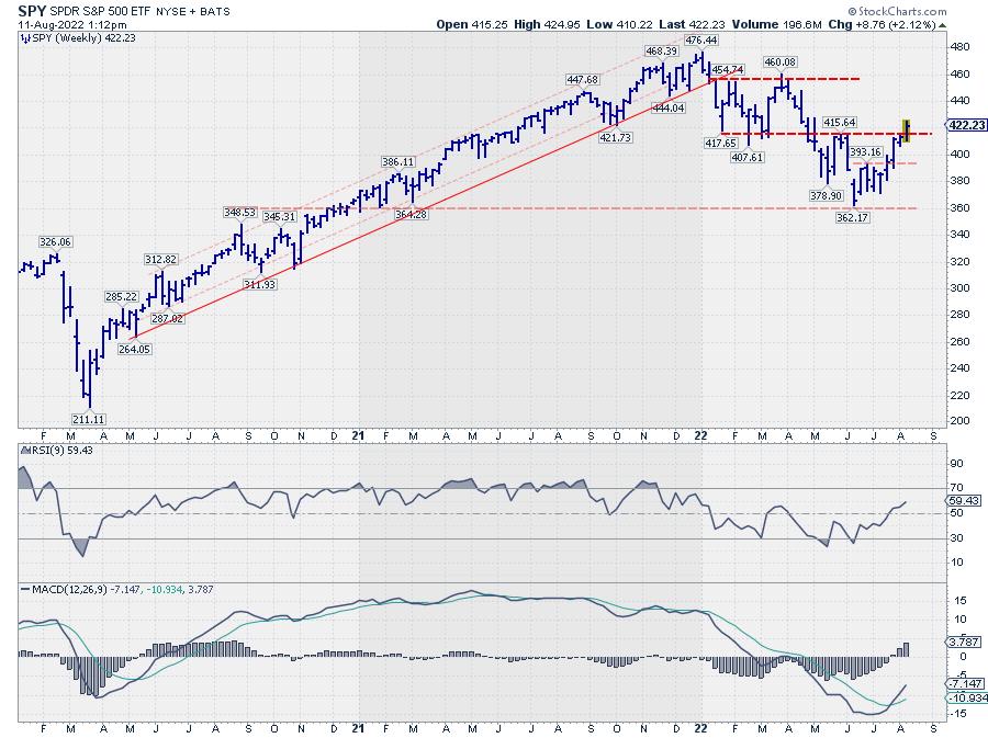
On this weekly chart, SPY is breaking above its previous high, which puts an end to the rhythm of lower highs and lower lows. It does not immediately signal a new uptrend, but merely the transition into a more sideways move.
My big question is: How sustainable is this move?
And it is based on the observations that only a handful of stocks inside the Consumer Discretionary and Technology sectors are showing relative strength vs. their respective sector indexes.
Consumer Discretionary
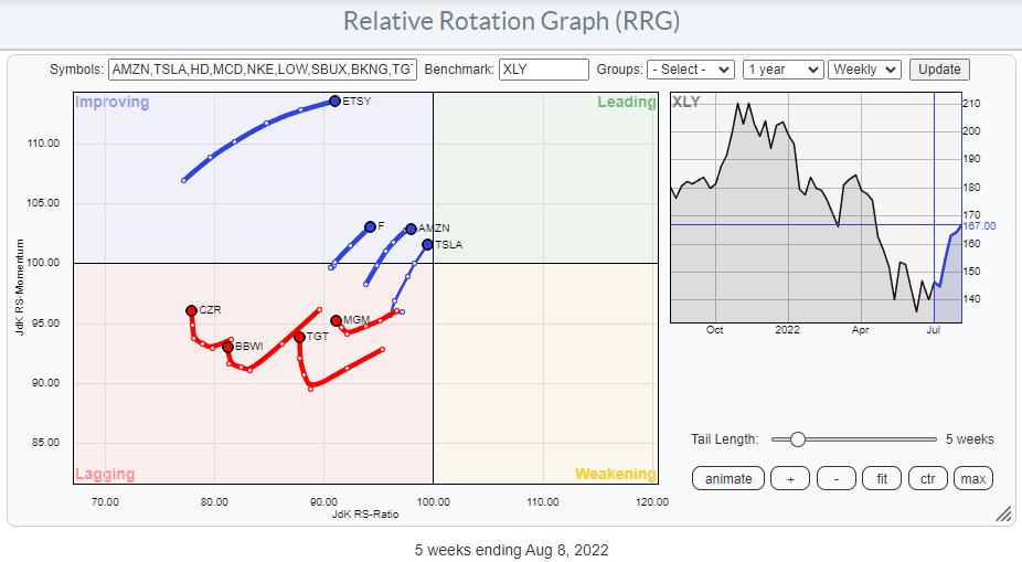
The RRG above shows the tails for stocks that are at a positive (or almost) RRG heading. Applying this filter only leaves eight out of the top 50 Consumer Discretionary stocks, including heavyweights AMZN and TSLA.
Information Technology
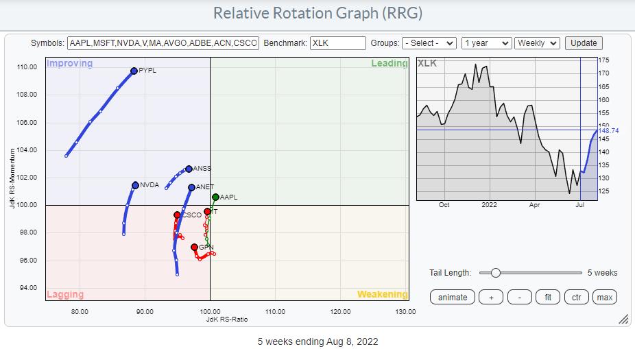
Applying the same filter on the universe of the top 50 Technology stocks also only leaves eight tails that are moving at a strong RRG-Heading, including AAPL, which by itself is already 25% of the market cap of the sector. Only eight stocks per sector are picking up more relative strength, which makes the participation base for this rally very low.
Another way of using the RRG visualization to take a look at breadth is to plot the members of each sector not against their sector index, but against $ONE. This takes the relative component out of the graph and shows absolute price trends.
The simple interpretation is:
- LEADING: Uptrend and pushing higher on strong momentum
- WEAKENING: Uptrend but momentum getting weaker
- LAGGING: Downtrend and pushing lower on weak momentum
- IMPROVING: Downtrend but momentum is picking up
Below is an updated version of the graph, which I put together about two months ago, showing these RRGs for all sectors (and at sector level against SPY).
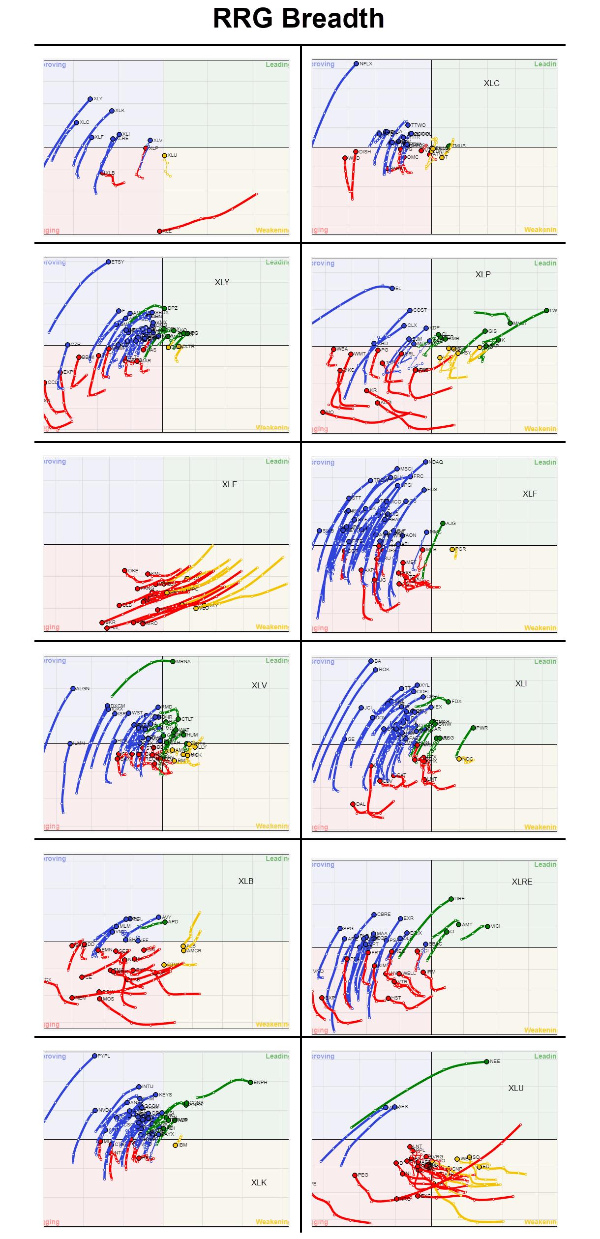
Looking over all these RRGs, it is very clear that the market is recovering, and there are a lot of blue tails. But it is also clear, at least imho, that that is what it is; a recovery. There are still very few green tails.
One more breadth chart that I track is the number of new 52-week highs, in combination with a 13-week (1 quarter) moving average.
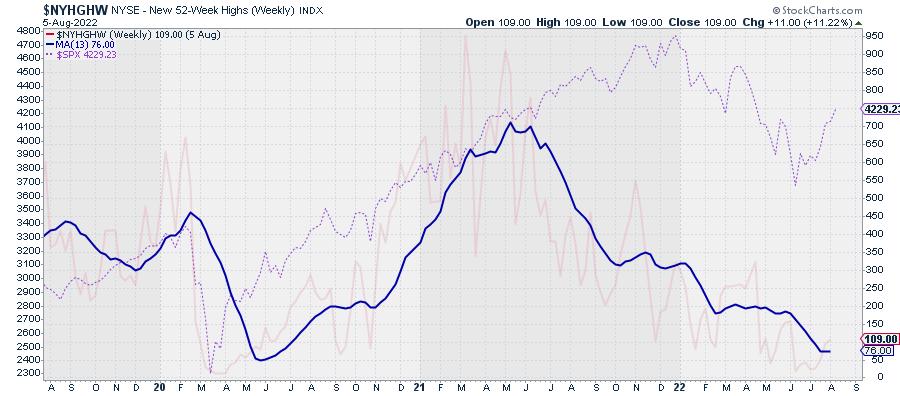
The opaque red line is $NYHGHW, with its 13-week MA thick blue. As a reference, the dashed pink line is the $SPX.
The series of lower highs and lower lows in the $NYHGHW is very much intact, and the metric is at low levels from an absolute perspective. But the MA is still moving lower and not yet showing signs of a reversal. Yes, I know this is a contrarian indicator, but I also know that these types of indicators can stay low longer than you would expect.
All in all, things still keep me cautious. Only two sectors lead in terms of relative strength. Inside these sectors, only a handful of (big cap) stocks are doing the hard work. And, from a price perspective, the majority of stocks are still in a downtrend despite the recent rally in the S&P 500.
It is very well possible that the low for this move is in place, but, even if that would be the case, I expect the market to hammer out a more solid base and get broader participation to the upside. Until then, the foundation remains shaky.
Julius de Kempenaer
Senior Technical Analyst, StockCharts.com
Creator, Relative Rotation Graphs
Founder, RRG Research
Host of: Sector Spotlight
Please find my handles for social media channels under the Bio below.
Feedback, comments or questions are welcome at Juliusdk@stockcharts.com. I cannot promise to respond to each and every message, but I will certainly read them and, where reasonably possible, use the feedback and comments or answer questions.
To discuss RRG with me on S.C.A.N., tag me using the handle Julius_RRG.
RRG, Relative Rotation Graphs, JdK RS-Ratio, and JdK RS-Momentum are registered trademarks of RRG Research.